1) Are the titles/credits Separate to the moving image, incorporated into/superimposed over the moving image, or is it in the form of a mini narrative?
2) Conduct a textual analysis. You will have formed a strong idea as to what the opening credit sequence is trying to communicate. Cherry Pick "eight" significant aspects relating to its construction. You need to blog "How" the credit sequence has been constructed in order to communicate this. Consider two aspects of Mise en scene, two relating to sound, two relating to camera work and two relating to editing.
The mise en scene suggests - elements of costume show that the hands most likely belong to children as before the titles sequence there was an opening sequence which included children wear a uniform which matches the hands in the titling sequence.
The element of lighting creates silohettes which again represents the children but also the 'creepiness' of the children either reaching out towards something or ripping at the wallpaper (we have found out may be something to do with the narrative such as the children are ripping away at the secrets in the walls.)
Parallel sound is used as the image used matches the mood of the music, as it is a bit quirky and strange. The music builds up in pace with a serious tone. The rips of wallpaper coinside with the pace of the music.
The camera work uses a panning technique to follow the cracks of the wallpaper, this is part of the mini narrative. A close up of a shadow/silhouette (lighting technique) appears in the middle of the sequence and shows a hand (not known to be a childs or adults) to create suspense.
The editing was probably done in this way so that it makes the audience want to know more - by using a mini narrative. The ripping of the wallpaper and the hands of the children have been edited with the pace of the music. The wallpaper sequence was most created using CGI.
 The title sequence to the film old boy is also a mini narrative. It includes words superimposed over clocks. This which raise enigma - cause the audience to raise questions. The title sequence includes lots of images of clocks - The actual title itself forms and some of the letters tick anti clockwise like a clock. The opening sequence itself does not include clocks which may cause the audience to continue watching as they may want to find the connection between the title sequence and the narrative of the film.
The main props used in the titles sequence are clocks. We as the audience do not know why they are used in the titles sequence. This may have something to do with the narrative. Also it appears that the clocks are ticking in an anti clockwise direction. Colour is important when considering the mise en scene used in the title sequence as the colour of the background and the actual titles work with each other.
The sound used in the opening sequence is music and the sound of clocks ticking. The music makes the title sequence become quite eery which will invite the audience to continue watching so they find out what will happen. The mysterious sound may be used to show the audience the genre of the narrative which may possibly be a thriller.
The camera work included in the title sequence includes close ups (CU) of many different clocks ticking anticlockwise. This may cause the audience to question why there are clocks and what is the point of having them there.
 The title sequence includes images and text superimposed onto what looks like old fashioned paper. The title sequence seems old fashioned this includes the font which is looks like it was created by a quill, and the stained paper. This connects the original origin of the narrative which was created by Arthur Conan Doyle in the late 19th Century. The text used in the title sequence is always on a block of solid colour.
The sound used in the title sequence is dramatic and parallel as the genre of the film is action/adventure. The images appear and turn into still life pictures at the faster pace of the music. The music used is the kind that would have been listened to in the late 19th century which co-insides with the original narrative.
The mise en scene used in the opening sequence includes props which the characters are holding for example a hand gun which may portray a character as violent or acting in self defence. The mise en scene also includes costume, hair and make up. As the film is set in the late 19th century the attire that the characters wear portrays the era, for example the character 'Irene Adler' (played by Rachel McAdams) always wears brightly colour dresses to portray her character as bold.
The camera work includes camera movement. The camera movement in this sequence includes the camera panning from picture to picture. The editing involved includes transforming a photograph into what looks like a drawn picture. This is all shown on old fashioned (almost tea stained) paper.
True Blood
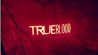
 The 'True blood' opening sequence includes text that has been superimposed onto pictures which relate to the genre of the TV show.
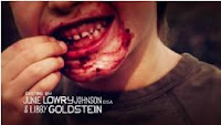
 The mise en scene3 varies from image to image as different things are shown. The images used portray a fear or connect the the common theme of vampires as this is what the narrative includes. The colour of red is commonly used throughout this sequence as this mostly likely represents the blood or danger which is associated with vampires. For example the children eating some sort of forest fruits - the editing makes it look like the children are associated with the theme of vampires.
 The Incredibles
 The title sequence for 'The Incredibles' takes place at the end of the film. The title of the actual film is superimposed on a red background. The font is white and in bold.
The other names that are mentioned use the same font and are also placed onto bright blocks of colour to make them clearly seen.
 The non diegetic music is dramatic and is 'jazz like' as instruments such as saxophones and symbols are used. The narrative is shown through animated shots of the characters. The next shot is shown when symbols crash in the dramatic music. The editing includes fast changing transactions of different images. The images used are shots taken from the film itself but more 'cartoon' like. For example the characters shown are just shaped blocks of colour.
The mise en scene varies for each shot as the different characters are in different locations and therefore each location has different decor. The costumes used in each shot vary as well but all share a theme of 'superhero'. The shots used resemble the main events and characters who have been in the film. Camerawork wouldn't have been used in the literal sense as the film and title sequence are both CGI (Computer Generated Imagery) but there is camera movement as panning and tracking techniques.
This is England
The title sequence includes people and events that have effected England around the time that the film was set - the 1980s. For example Margaret Thatcher is shown in the bottom right hand corner of the image as brought about many things that would change England.
The mise en scene varies from image to image but the the main location of each is in England. The British Flag is used in many different shots, this shows that the people that hold it are patriotic. It is quite ironic how the film itself is name 'This is England' yet the flag shown in the title sequence is the British Flag (including Scotland, Wales and Northern Ireland) This is probably so that the film sells better nationally.
The camerawork includes many close ups and long shots which very in each image. Each image is in deep depth of field so that the audience focuses on each image.
The font of the actual titles is formal and bold. The actual reasoning for the font is that it is suppose to resemble the font used on Army Dog Tag's as the main characters father dies in the Falklands war and the font used is suppose to relate back to this.


good, well done
ReplyDelete